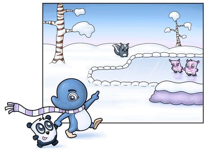
Hey there folks. This is a piece I finished about a week ago. I had very high hopes for it:
And I'd have to say that I'm disapointed with it. But I'm not sure why! I wanted it to be a piece that introduced the little pillow looking characters (that's what my wife calls them). On my blog I posted each element individually - which I liked, but all together, they just don't cut it. I tried adding more blue shaddow to the snowy ground, but...? I don't know.
The linework was done in Illustrator and then copied over as a vector smart image and colored in photoshop. Also - Adelia (the blue penguin character) usually doesn't have eyebrows, so when I rework this piece, that'll be the first thing to go...
So I thought I'd start with my worst piece and work my way up...any advice would be greatly appreciated!
Subscribe to:
Post Comments (Atom)


5 comments:
Heya,
On your blog it was fun going through each individual illustration then BAM!, it all came together into this one piece. I loved it. :)
For me the heavy black line for the box is distracting from the characters inside the box. The width of the line dominates all of the other black lines. It's also battling against the black in the "pillow" characters. Try bringing that width down.
Also, bringing some yellow into the box will contrast with the "pillow" characters awesomely, or at least, it should. They're purplish pink, and yellow is it's compliment. :)
I think your characters are adorable! And they are definitely fresh. So happy to have you aboard Isaac.
I really like the theme you've established with your characters. The fact that they're "pillowed" reinforces that they are yours. I'd kinda like to see some of that same theme in Adelia, too. Although, maybe not if she's older than the other characters. She seems to be older than the rest....hence the others have not necklines. Are you doing that to show an age difference? Either way I like it...very stylized. You've definitely worked through who these character are.
In looking at your portfolio, I also saw you adding lots of cool texture to many your backgrounds. Is that something you've considered on this one?
These little characters rock -- I love the pillowy look, it gives them a unique style!
Hm.... looking at it compositionally I think what bothers me is the shape of the pond and the snowdrifts around it. It just looks a little too geometric and even rather than the more random/irregular shapes of nature. Maybe giving the pond a rounder shape towards the back and making the arm a little pointier for perspective would help, and perhaps taking away the snowdrifts around it and making larger, more general drifts at the bends in the pond. I also like Sara's suggestion of putting more yellow inside the box, it would be a good balance for the blues/purples.
I do very much like how you've put the two characters in the foreground outside the box yet interacting with it. Very clever! The long waving scarf definitely adds something to it as well, kind of like a visual path into the scene.
I think that all the separate "pieces" are wonderful. I do agree that the final execution fell short.
I think you might have better luck if there was more overlapping of the images. Right now you have a tree in the upper left, a group in the lower left, a figure in the middle, a tree in the upper right, and the big purple snow covered rock in the lower right pulling the eye right out of the image.
A trick a lot of the masters use is the figure "S" going through their images. Try and develop an "S" with you assorted parts. I bet it will help a lot.
Also, to make those pillow characters pop (they are very cool) add in some contrasting colors to draw the eye toward them.
Revisit the rock which pulls the eye away from the painting. Work a little more on the scale of the pillow people and the skunk. They look about the same size now, although the skunk is in the background and the pillow peeps are in the mid-ground.
This is a great image, keep working with it. I'm sure it'll be a winner once you've worked out what's bothering you. (The blue guy in front reminds me of Pogo.)
I love your characters, but I agree with the above comments about this final version. Those would all be good changes. I agree that Adelia doesn't fit in with your adorable pillow friends mostly because of how her beak and eyes works (for me). Her eyes are what threw me off (one versus their two). And she does look older due to her body shape. Lastly, I think the box is too linear for the softness of the pillow scene. Could you soften the edges and have the trees and pond go above the edges of a curvy outline? Not sure if that is clear, sorry. LOL
They are all adorable separately and I think they can come together with several of the suggested changes. Keep working on it for sure. :)
Post a Comment