

Thursday, July 29, 2010
another cat and dog drawing
I don't know if you remember me posting a picture of the cat and dog in the trunk as a plane flying marshmallows towards the sun...well that was their imagination - and this is the reality. I finally got around to drawing and coloring it.

alla prima #2


Here's my second alla prima, with more emphasis on accuracy. I'm still learning on the colors and will probably be making one of those color referencing gadgets (basically a black and white card with a hole punched out) to reference color more accurately. There were so many tints shades of blue and green in this one that I started to get lost! I'd say total time was near 3 hours.
Wednesday, July 28, 2010

Tuesday, July 27, 2010
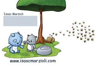
my new postcard
I had mocked this up previously - but this is the final one - unless you can see anything wrong with it - I originally had the cat character in there - but have since removed it because I couldn't fit her into the jumping dog one without it looking too awkward.
Let me know what you think as I want to print these as soon as possible!

 Of course it won't have a grey square there but I just don't want any of you coming to my house.
And anyone going to the LA conference? I probably should have (for the second year in a row) especially considering it's right around the corner from me...but maybe next year...I'll have even more stuff to show at that time...
Let me know what you think as I want to print these as soon as possible!


And anyone going to the LA conference? I probably should have (for the second year in a row) especially considering it's right around the corner from me...but maybe next year...I'll have even more stuff to show at that time...
Monday, July 26, 2010
1 hour alla prima

oil on paper
5 X 7
Found this portrait picture in a National Geographic magazine and though I'd do a one hour painting again. The likeness isn't really there, but maybe with practice it'll improve...


Sunday, July 25, 2010
going down a different path...
So this is for a brand new idea I have - I have to pitch it to my partner to see if it's even something she'd want to develop a story around...but, if nothing else, it was a fun little drawing that was outside of my usual.
Sort of...I guess I put a lot of what I usually do into this one as well - like the stumpy arms and the eyeballs...but the color and stuff...what do you think?
 Nick Jr (Nickelodeon for lil' kids) is coming back to town in the fall and I want to pitch them something crazy. I started with the three characters - one is a circle with a toe on it's head, another is a triangle, and the third is a one eyed square.
And i always seem to draw my characters running down a path...I need to broaden my bg drawing a bit...
Sort of...I guess I put a lot of what I usually do into this one as well - like the stumpy arms and the eyeballs...but the color and stuff...what do you think?

And i always seem to draw my characters running down a path...I need to broaden my bg drawing a bit...
Friday, July 23, 2010
Not sure about this one.

I found this in my files. One of my many unfinished works. I kind of like it and I kind of hate it. I don't know where I went wrong with this so any suggestions are welcome.
Thanks,
Steve
Thursday, July 22, 2010
The saga continues...

I did a painting for the IF title, "Diary." Sadly, that painting ended up in the trash. In that version I tried to use flat acrylic colors underneath the oils, but the colors all competed with one another. Then I started contemplating the underpainting more...and I came to the realization that I really like my burnt umber underpaintings (even the acrylic ones) more. I always enjoy seeing the stage where the light is planned out and tone is stated in one color. I continued reading and looking for online references and ran across the schoolism website (as recommended by Steve).
One of the current teachers, on that site (Thomas Fluharty) is running a class about oils, so I looked into it further. I watched a quick video segment in which he suggested the importance of the underpainting. I continued thinking. What is it that I like so much about the underpainting and why am I still struggling color? Well, I think I found the answer. I destroyed and currently destroy my underpainting my working too opaquely. On top of that, I'm going to way too much detail too fast. I'm overdoing it.
I think I'm still stuck in the "I better get this paint down as fast as possible before it dries" mode of acrylic painting.
I'm going to do this screenshot from one of my favorite Pixar movies while trying my hardest to preserve the underpainting while glazing in color layers. The goal is to still see these values and to trust the underpainting.
I've also decided to give up creating anything original myself until September 1st. I'm going to steal and copy paintings I like while focusing entirely on oil technique. Hopefully at the end, I'll have a method to apply to my children's art that will allow for more creative freedom...instead of frustration.
Thursday, July 15, 2010
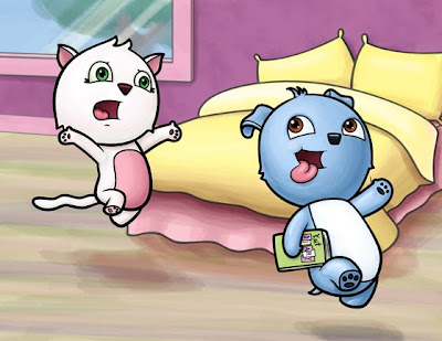
ugly colors a bit better
So I tried to take your suggestions into consideration - what do you think of this? I went into Adobe Illustrator using the colors that I did for the characters and used Illustrators 'color guide' to match the pink of the cat and the blue of the dog to complimentary colors.
From the original - I wasn't happy that the bed was one color...and the floor bothered me. Also I took Pete's suggestion of doing something out the window - I then went on a different layer and painted over it to make it look more abstract and window like.

What do you think?
revision!
From the original - I wasn't happy that the bed was one color...and the floor bothered me. Also I took Pete's suggestion of doing something out the window - I then went on a different layer and painted over it to make it look more abstract and window like.

What do you think?
revision!

Tuesday, July 13, 2010
I feel the need...the need for speed!

I'm not completely happy with the way this one turned out. I like the light source mysteriously emitting light from within the trees and the mood created by the expression on the giant.
The biggest hurdle I'm dealing with is the drying time. "Fat over lean" is really slow for me, so I'm going to try an acrylic underpainting with flat colors as a base next time. The layering and layering and layering kinda limits how much I can accomplish in one sitting. And doing "Alla prima" all at once with no mixing is beyond my experience at this point. I've heard of painters combining acrylic underneath oil, so we'll see what happens!
Monday, July 12, 2010
stupid Diary topic
This illustration took FOREVER! so annoying - and I only did this drawing because the illustration friday topic was diary. Anyway - I need help with color...you would not believe what this looked like after my first pass...I sort of like it now, but what do you think?


Sunday, July 11, 2010
Delayed and well overdue update
Unbelievably, my book is still not done. I am doing my final revisions/corrections this week and then I should be done. Now that it is almost done, I can be introspective and see what I have done and how much I learned. I am glad I took on this project...:)
I am moving into town this month and I was sick almost all of June, so my time now and over the past 2 months has been really, really tight. I am still working on digital stamps and rubber stamp designs as my main source of productivity and income, but I have a goal of changing that this year. I have a new focus on creating a portfolio for children's books, instead of portrait shots for stamps after attending an excellent conference with Terri Murhpy and Kelly Bennett. It was very inspirational. Terri is the illustrator of many books and over the two-day conference I really enjoyed picking her brain, learning how her technique developed and just how she goes through the process. It also made me decide to give myself a break and take the time needed to be as good as I can be now and take more time getting better...looking over illustrations from 2 years ago, it is amazing to me how much change has happened. LOL So the main idea is that, you are never anywhere but where you are so, so you are as good as you are now, and in 2 years you will be better...
That was the main message I took away from the conference...stick to your style, develop it and be true to that...no matter how long it takes.
I don't have any new pieces started for that process, but here is one shot from the book that should be completed this week.

Thursday, July 8, 2010
Chugging along...

Here's my current WIP. More oils, more liquin, more odorless turpentine. I'd say its about 60% done and hope to finish by Sunday evening.
It's for Illustration Friday and hopefully my next postcard. I'm going to try to produce about 3 high quality portfolio pieces per month and select the best for marketing. I'm planning on sending postcards out every 2 months.
Here's what I've learned thus far about oils...
1. They dry sssssslllllllloooooooowwwwwww.
2. Liquin helps to keep the finish matted while working and expedites drying.
3. You can't use the same brush throughout the painting. I'm constantly switching and washing.
4. Oil paintings start out looking pretty awful until the layers of paint build up. But, good news, they start looking better the more you work them. I'm just now starting to think this one's going well.
5. Areas of color (including shadows/highlights) have to be preplanned or I make a muddy mess of color. Mixing wet in wet is difficult.
6. I feel like I have more control of this medium to make it perform the way I like. Acrylic is nice - but I like this better already. I'm not turning back.
I like that we're posting more. See you on the board!
Piano playing
So I don't know if I've said this already - but Nick Jr (nickelodeon for lil' kids) passed on my pitch. From it I found a pitch partner (a gal who also pitched, but is also the script coordinator on Fairly Odd Parents and Tuff Puppy, and she's written an episode of Fairly Odd Parents AND she has a reality tv show in development) and we're going to retool my pitch (and hers) and see about getting it stronger and eventually we'll re-pitch them to studios around Los Angeles.
It's weird how solo children's book companies want everything to be - but animation really encourages collaboration. So we'll see how it goes - I figure that if we don't get something made into a cartoon (which is very likely considering how hard it is) we can attempt to adapt them into children's books...or even, if the characters are strong enough, try to license them. But we'll see...it's the beginning of the process and we have a ways to go.
Anyway - here's something that doesn't relate to the above - but I just finished it and wanted some critique!

Monday, July 5, 2010
Character tonal study
This was done in Photoshop - any suggestions?

So I did a little bit of a revision - popped more of the highlights and changed the shadows:


So I did a little bit of a revision - popped more of the highlights and changed the shadows:

Subscribe to:
Posts (Atom)


