Thursday, January 29, 2009

Adelia Holds Out...

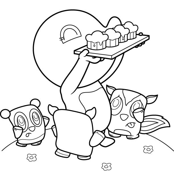
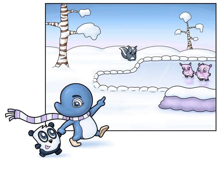
So I finished with the color.  I originally drew it to have the color taper out on the edges...but even though I like the look of that on other people's drawings, I couldn't bring myself to do it - so I extended the ground hill and made it a full page image.  I'm posting it here because I really like this piece - and even though it originally was going to just be a quicky drawing for IF, I took it a lot further than I originally expected...and I'd like to know if anyone has any suggestions.

Photobucket

The tiny conference is on the 7th, so I'm hoping to get many a new piece in my portfolio.  And I gotsta spruce up the old ones a bit.  What sucks is that I was originally doing Adelia in a completely different style of painting (using the grass brush in photoshop)...which made for quite a nice texture (in my opinion) but I've moved away from that and am painting her normal (with regular brushes at lower opacity)...anyway - that has nothing to do with this, so whatever.

Oh - and one last thing - should I do a frame around it?  Or should I just leave it as is...?  I'm leaning towards a black line framing, but that's just because that's what I do with almost all of my pictures...

New Webpage top

Hi everyone. About website changes…well, here is mine. The one I have now isn’t a strong design. I love Sara’s detail and wallpaper back ground, but because my colors are bolder I don’t think I can do much more than a paper text. The characters at the top are for a book I’m writing (won’t come out for a long time), but I think they work for my site. My blog header is from a page spread (same story). Anyway, I plan to keep the role over feature and page color changes (but with texture). I’ll also add white or pale text boxes. It’s not really fancy. Your thoughts?

Wednesday, January 28, 2009

New Site Look

Site is all up and done! Whew! Thanks so much for the comments, doin' something like this gotta know whether it's working or not. Great back up! ;) Take a look-see when ya have the chance. There'll be more kitties...like what's in the portfolio, throughout the site...just gotta create them first. :P
http://www.sarabutcher.com


Been working on this all night, my wrist is sore from using the mouse too long. :/ The composition is the same pretty much, but a change in environment. I can never stay with one look for the site too long...it's a work of art!

The kitty on the page moves around from page to page. Tho...you can't see that. But she goes from one corner, to the next, doing different things.

So here's the sample of what it would look like. Want opinions before I rework the entire site:
http://www.sarabutcher.com/sample/sample.html

And here's my current site..so you can compare. :P
http://www.sarabutcher.com/elegant.html

Tuesday, January 27, 2009

Adelia Holds out...

Hello - so I did a sketch of this for illustration friday - and I rather liked it...enough to clean it up and revise it and such.  I wanted to post it here to see if anyone had any suggestions for it before I went and colored it.  Well, hmmm?


Photobucket

Help with website

Hello everyone
I'm needing help with my website.

http://www.wendyoffield.com/

It is currently a work in progress so it is far from done but I figured I would ask for input before I get to far along. I'm considering putting a more textured background, I think the site just seems kind of blah. I have enjoyed every one's websites and know that your the folks to go to.
Thanks,
Wendy O

Sunday, January 25, 2009

conference business cards...

taking myself serious? It's a weird thought...but here goes. I'm actually going to attend a conference! Sure it's not the big NYC one next weekend (anyone going to that?), but a smaller one day conference in San Diego. I'm working on my port and promotional stuff, but I felt like i needed some sort of business card...just in case.

here are a couple of prototypes - I wonder what you'll think...maybe you can comment? I'm probably going to have them printed up this week (the conference is on Feb. 7th).

Photobucket
would you even include one image? I mean, if it's a great one then terrific - but way back in school I think I remember someone saying something about how if you put that you're this or that or include a picture that they'll maybe only think you can do that one thing...? I'm obviously keeping my cards very simple...I was thinking of putting an image in full color on the back and then my info on the front...and it's not that much more expensive...

Friday, January 16, 2009

On the subject of websites

All this recent talk of website changes had me paranoid about getting mine in ship shape too! So I went through it to hopefully emphasize that it is primarily about the illustration portfolio rather than my previous body of fantasy artwork, although there are galleries for both included. I am not going to toss out the fantasy galleries completely, but I do want to make it obvious for people to get to the illustration portfolio and for that to be the *first* place they look (other than the index page). I was also pretty brutal on my portfolio and tossed out a bunch. Even learned a wee bit of javascript, heh. So.... what do you all think?
http://www.carmenkeys.com
And in the portfolio part itself, I could really use some help about what my weaknesses are and what I should be adding in the future to make it stronger. Should I toss out any that I have there? Just looking at it myself I can see I have a lot of vertical, static type images that don't have a lot of movement. I need more movement!! And more interaction, I reckon. Thanks for your help everyone, I must know what to work on this year to make this as good as I can!

Totem pOWL

--------------------------------- UPDATE Below


Ok, my first of several rough drafts; more to follow tomorrow.

I moved the owls in the middle but I'm not sure if I should incorporate the moon or not. Also, do the branches on the lower left side look too much?


--------------------------------- ORIGINAL POST Below

Wow, what a week. I was sick for two weeks, my monitor died two days ago, my semi-broken scanner's usb got thrown in the trash by mistake yesterday, and today - another car clipped my rear bumper as the driver was pulling out of the parking space. I was parked and trying to phone-order take-out lol.

Whew. Anyway, since my last post about owls was *meh* I decided to try to draw more owls for practice. I added the moon in photoshop because it only occured to me as I was cleaning up the terrible scan from my other crappy scanner. Does the composition work? I had originally wanted to make it super simple (and may still) with textures for trees, but I'll see how it shapes up. I'm going to try to be smart and print out the line art and color different copies and see which you guys think is best.

~ kris

Thursday, January 15, 2009

Prickly Love - Tiddly Inks/Christy Croll


This is watercolor, pencil and ink. It was touched up in photoshop to darken the black. I have to get a new scanner because my colors aren't coming through true and it bugs me. LOL

Need quick help

Please visit the private section and view the color study for the first illustration of my book project. It's taking forever to figure out because I'm only doing one for the whole book (since it's the same color theme throughout) but the author and I can't make a decision.

So please visit it, I need to get to paint today. :/
Thanks A BUNCH ahead of time. :D

Adelia: Left out - FULLY EDITED AND DONE!


EDIT #2 - I took the piece out for another ride and rechanged and readded. Thanks again for your suggestions! Oh, and I changed the clouds...so they're not sucky anymore. I can't seem to move them around...so the new one is there, and the old one is there...I tried for side by side, but this was the best I could do...but you get the point...One is good, one is suck.

Well...this piece took FOREVER! I've been used to doing a lot less scenery and characters in my drawings - so putting 5 characters into one - and one where they're not in snow - meant that this one just took forever to finish. But is it done? I'm putting it up here, before my blog - because I want to know what you think of the color and everything all together. Even if you see something wrong with a character or line or perspective or whatever. I still have my vector image preserved, so I can still easily change my lines...but what do you think?

I'm going to attend the San Diego one day conference (the ny one is too far) on the 7th of February...and I want this to be my lead image in the port review and if I get the chance to show anyone. So, obviously, it'd be important to make this image the best it can be.


EDIT: I've put it up on my blog - with Pete's suggestions! Thanks for your help Pete! Also - if anyone else wants to say anything - I'd love to hear any other suggestions! I would have put the new version up on this site, but for some reason it won't upload...

Wednesday, January 14, 2009

Illustration Friday: Contained (UPDATED 1/19/09)

Okay, I have the changed version of this to show you! I took many of the suggestions, thank you so much. I think it really turned out so much better because of you!


***********


Fire is generally much safer when contained.

I was a bit concerned about the perspective of the table and things in the foreground, as that is not my strong suit. Also attempting candle flame in graphite was a challenge!

Monday, January 12, 2009

IF - Containted


"Yeah...he's not coming out to play today."

Just a quick, light, and very small (3.5 x 3.5 about) illo. Nothing for the portfolio, but got a chuckle as I worked on it. Been way busy figuring out perspectives and new perspectives, and even newer perspectives (did I mention I HATE perspective?) for my book project. ugh. So this is straight forward, no complication, easy breezy. :D

lllustration Friday - CLANDESTINE


I've been trying to catch up with a few recent IF themes. Today I finished "Clandestine" - what a great suggestion! I'm going to do a couple more this week. I'm having way too much fun with these!

Sunday, January 11, 2009

CIC - Owl

I'm working on this pastel painting for the Children's Illustrator's Club in Deviant Art. This month's topic is "Owl." Btw, this picture was cropped a little bit because it was crooked, so there's actually more space on the left.

Right now it's just a very rough work in progress. As you can tell, I'm a big fan of Van Gogh. Is the composition working out? Should I add some stars? I'm scared it might look *too* much like Starry Night, since I did kind of appropriate the moon. The sky is definitely not done yet.

Also, do you think I should add some houses at the bottom, or would it be alright to leave the bottom mountain just a mountain? The blue is just the underpainting right now.

Thanks for your help in advance! Now I'm going to go and binge on some ice cream/comfort food since apparently the Giants won't be in the Super Bowl this year :(

~ Kris

---------------------------- UPDATE
Sorry for the slight blur - I had to take the picture under my flourescent light since I couldn't wait till day light tomorrow.

I added some heart/stars and worked on the owl (I know, I said I didn't want it to look *too* Starry Night, but meh, I figured I may as well). I'm not happy with the owl at all, so I think I will wait to do the other one. I think she looks slightly angry O_o Anyway, I'm not sure if she pops out enough, or if her colors just look blah.

:/

Illustration Friday-CONTAINED


Jars ended up being a common thing in this weeks challenge!

Saturday, January 10, 2009

Illustration Friday - Contained


Hi ya guys. I am having trouble with the perspective of the jar and lid here, but I have to take a break from it. Just thought I would ask for some help. This is a line of characters that I draw for rubber stamps called HuggaBuggs...they are a cross between buggs and fairies. :)
This is about an hour of digital painting in photoshop. I will definitely be going back to work on it.

Friday, January 9, 2009

Illustration Friday: "Contained"


Hi, all: this is my first official post and it's kind of a sorry one at that ^_^ I'm a terribly slow worker with a huge case of artist block, so that's why the WIP is in differing states of line and color.


For IF, I wanted to show a little girl with a magical...something...pearl, maybe. The pearl itself will radiate swirling colors of...blue light. I'm not sure what to do with background or her surroundings yet (I'm sure it'll take me another week to come up with something), but any advice/critique about what I have now is definitely welcome (especially her proportion and the location of her feet). I'm using markers, so I'll probably airbrush the swirling colors last. This was supposed to be for last week's theme (ha!) but, like I said, I get blocked and then I just plow through as best I can. I got stuck on the head and before I knew it, it's a new theme -_-

I'll keep working on a background in the meantime.

Adelia: left out...


So - I wanted to show this one...it's a companion piece to the other one I recently posted (but that one is still being revised)  I wanted to get your views on the composition...and if it's working or not...?  I wanted to do another drawing with all the characters from the previous illustration.


Thursday, January 8, 2009

It's been 2 years...

Since I updated my web site. And, truthfully, it's a bit of a mess right now because I just switched to new host. BUT, I could really use some fresh eyes to weed out the weaker pieces and offer comments on how to make improvements. (Aside from the pages which are missing right now and the blog who's skin didn't make the move intact.)

So what say you?

http://www.wendymartinillustration.com

Don't hold your punches, I want to have a wow site like the rest of you and it's not there yet.

New and final member!

We have a new member who will appear shortly. Please welcome Anne! Her work is adorable and very fun loving! Visit her site and feel great! www.annejewett.com

She is also our final member unless we decide otherwise. We have all twelve members. Look around you everyone, these folks are your new family. ;)

So glad to have you on the team Anne.

blog banner


EDIT: Above is the final blog banner. I decided to make the background completely void. It works with my minimalistic blog design because the background is white too.

Hey guys, this is supposed to be the background for my blog banner. I am still a little unsure of some things. I think it will obviously look different with text, but are there any areas that need a bit more color?

Super Bee


I just want to say thank you to everyone for the warm welcome. I am really jazzed because this group has already motivated me. I spent all morning working on an illustration for IF "resolve". I thought it was a good word for me, because I am resolved to put together a strong portfolio. I will post the picture tomorrow. I am a huge procrastinator, so I was hoping that this critique group would light a fire you know where.

Here is an etching that I did last fall. The black line is the actual etching and the yellow and pink are paints that I loosely painted onto the plate before printing it. I am not planning on printing anymore anytime soon, so this image is an "as is" one for now. I am very attached to it at this point in time, and I was thinking of using it as my postcard. What do you all think? Does it work? I want something memorable that will make someone want to call me back so that I can show my more thorough portfolio, but I don't want to make a mistake with the postcard choice. Is it too edgy? Would love to hear what you all think. Thank you!

It is a picture of my daughter sucking on her Bee (blanket).

Wednesday, January 7, 2009

IF - Resolve


Finished! At least on my end. If something still stands out as off or not enough let me know. :) Thanks for all the crit, I took a lot of it into account. Of course, kinda frustrated that the paper wouldn't lay flat. :/ grr...

Carmen's Illustration Friday: Resolve (UPDATE 1/19/09)

I put in grass as y'all suggested.... it does make a nice anchor. :)


***********


Although the wind was howling fiercely, William resolved to deliver the box of medicines to its destination.
So.... I'm thinking again to do a color version of this! I seem to be doing a lot of graphite these days for IF. I've been sketching these little rabbit guys for weeks and I can't get them out of my head! So, does this work? Is it too lacking in depth? I was experimenting with this "negative drawing" thing in the background...

New Member

Hey guys, just wanted to share and let you know that we have a new member arriving. Please welcome Patricia into the group. She's got a beautiful style and is trying to break into the children's book industry too with her paintings. Check out her awesomely created site www.patriciakaegi.com!

Tuesday, January 6, 2009

Scanning images

Really quick question for you guys: what scanner do you use to scan your images? I have such a hard time with my scanner, since it puts a pink line in the middle of my drawings and I usually have to scan it multiple times so I can piece it together in photoshop.

Also, I plan on working in pastels and quite possibly on big paper. Will taking pictures of these works suffice, or should I look for oversized scanners?

Advanced thanks for your help :)

Monday, January 5, 2009

Late Nights

Hey, just a fyi, for 2009 I've created a new schedule so that I, hopefully, will spend more of my day working instead of dilly daddling. But, this new schedule requires I don't chit chat online until after 8 or 9pmish. So throughout the day it isn't because I'm ignoring you guys or don't have anything to say...it's just gonna be late night before I get to it. Setting some special time aside just for you! Whooo! :P

Just wanted to let ya know incase you start wonderin'. hehe anyhow, ciao. :)

If - wip/ink


So here's the color I have so far. I would love some feedback about what is working and what isn't, just keep in mind this isn't finished. :P


Okay, so here is the inked image, and you can see all the things I kept and all the changes I mentioned in my post(reply) for the sketch. Also, to answer the question as to how I drew the sketch...I used a blue prismacolor pencil on canson tracing paper. :) To erase I used a Tuff Stuff pencil eraser (or in lamest terms...the while eraser). A kneaded eraser didn't work so well. o.O

Panda having Tea


I wanted to share my second illustration of the Panda having tea. I loved a lot of the suggestions everyone offered. Thank you all for your help. I'm really loving this critique!

Sunday, January 4, 2009

IF - wip


I've been debating what to do for Illustration Friday this week and thought of this last night. I'm currently about to embark on illustrating a book about bedtime and thought I'd practice a bit. So the resolution here is helping a toddler fall asleep in his own bed. While I was drawing it I was imaging the poor thing had a nightmare or was tossing and turning. So mom, being the nurture (can't wait to be a mom someday!), comes to settle him.

I would love some feedback on my perspective as well as the composition. Perspective, ugh, is NOT a strong suit of mine and last night my boyfriend (Brian) n' I sat and figured out the basics of two point. I should have paid more attention in class. :P Go figure.

The piece will be painted in watercolor on hot press, using lots of purples, yellows/oranges, and blues. At least thats what I'm envisioning.

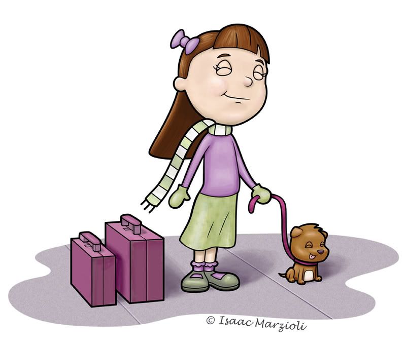
It's horrible - now with more edits!


Now, I'm not talking about the drawing...but that I recently changed my blog title from "The Boring Penguin Blog" (well, briefly it was Zombie baby pictures, but everyone that went to my blog thought it was going to be zombie pictures...and I was meaning zombie baby pictures figuratively...) so I changed it to Heebeejeebees. I changed it because I wasn't drawing penguins, but either cute little square animal toy creature things and the blobs that ate them. But suddenly all I'm drawing these days are cute things...and forgetting to include a horrible twist. the picture above is an example of that...

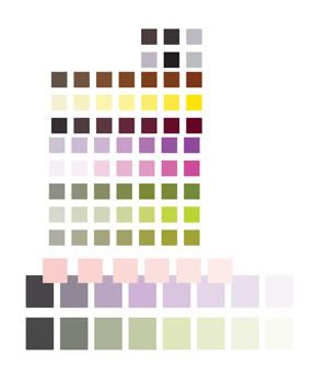
Anyhow - I struggled mightily with the color. I went into photoshop with a very clear color palette:

Photobucket

It's a habit I've been trying to get into - picking my colors in Illustrator before I export to photoshop. Basically I take a couple of colors I want to use - and then plug them into the color guide. It then gives you a spectrum of colors that compliment or are shades of or contrast the color you chose. I make my swatches (a bunch of squares) and then apply a color to each square.

Anyhow - things were rolling along quite well - with the green and purple...but then it came time to color the dog...I think that went well, but then the suitcases...I almost just took them out completely (but then I would have lost the story in the illustration)...I think I got the color to work, but I'm not in love with it...any suggestions?

I'd also like to hear - if you have time, what you think of the composition and characters and such...but only if you have time! Also - I really want to take my drawings to that next level. So feel free to be harsh! No need to pull punches! I needs to get the suck outta my drawings! And thanks in advance! Unless you didn't have time to comment...then nevermind...

EDIT: Now I made some changes - The first thing I did was do 'self colored lines' which looked horrible. It's something I haven't done before (I like the thick black line) so even with all the time it took to break up the lines from each other, I still had to scrap the idea...i dont even know if the changes show up on this small version...but basically I added a slight pinking to her cheeks - I had to tone it down from where I originally had it as the more pink i added made her look like she was bruising, not blushy...I also added some yellows to her greens. And to top it off I added a 16 percent saturation. Before I saturated it, I didn't even realize how grey her face was. Maybe I was zombie-ing her up a bit. There IS hope for me!

PS - I'm thinking of going to the San Diego SCBWI convention Feb. 7th. Has anyone been to this one before? I just joined the scbwi on the 1st, and I have no idea...but I'm going to go and I'm going to show. Or sit and listen...or what is it that they do, and what is required of me? If anyone is even still reading - maybe you could drop me a line at isaac@isaacmarzioli.com and let me know what to expect as an illustrator. There's a 20 minute crit with Joy Chu...and you can set up a 16 inch display...but it has to be a verticle display...and no postcards or things on the table...everything has to stick or protrude out of your verticle display. Say huh?


Photobucket

Saturday, January 3, 2009

Christy Croll/Tiddly Inks First Blog Post

Hi everyone. I am in the middle of getting my portfolio site completed, but hopefully it will be done soon. :) I am so thrilled to be part of this group. I have been blown away by the talent I have seen so far--really amazing stuff! :)

This is one of the watercolor and ink paintings that I planned to post to my pending site, so I would love some feedback in case I should reconsider or redo.

This is ink, watercolor, and colored pencil on 140-lb Canon cold-press paper.

Friday, January 2, 2009

Wendy Offield's first blog post


This is the first post I have ever made to a blog I hope it works. I'm at the very beginning of my journey to be an illustrator and I'm starting to put a portfolio together, so any suggestions would be helpful. In this illustration I'm trying to blend an illustrated space with a more pattern area, but I'm not sure if it is working yet.

Green Eyed Sue

Happy New Year everybody. This is an image I've been working on for a while. She's supposed to be about 14 yo and a pirate.

She will have a Jolly Roger waving behind her and a ship's wheel in her forward hand (which isn't drawn yet.)

I am toying with completing the image in Illustrator but may decide to do watercolor, which I use for most of my work.

Thursday, January 1, 2009

Comment Posting

...it has changed. It was driving me nuts hitting the "back" button all the time. So now comments pop up in a new window. If this drives you crazy, so much that you resent opening comments, let me know before it gets worse. :P

My first Illustration Board post - Adelia and friends...

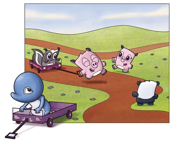
Hey there folks. This is a piece I finished about a week ago. I had very high hopes for it:

Photobucket


And I'd have to say that I'm disapointed with it. But I'm not sure why! I wanted it to be a piece that introduced the little pillow looking characters (that's what my wife calls them). On my blog I posted each element individually - which I liked, but all together, they just don't cut it. I tried adding more blue shaddow to the snowy ground, but...? I don't know.

The linework was done in Illustrator and then copied over as a vector smart image and colored in photoshop. Also - Adelia (the blue penguin character) usually doesn't have eyebrows, so when I rework this piece, that'll be the first thing to go...

So I thought I'd start with my worst piece and work my way up...any advice would be greatly appreciated!

My Illustration Friday Piece


"The Owl and the Pussycat are an unlikely pair -- they must meet in secret to avoid the stares!"
(If you click on the image it will show a larger version).
Okay, here's for my first post! I did this graphite illustration for the Clandestine theme, it's about 8x10". I wanted to do a watercolor version of it later so I'd love to see how I could improve it before I dive into that. I do know my boat-drawing skills need help! How about the composition? Anything I need to add? Take away? Re-draw entirely?

Public vs Private

Hey guys, wow, I'm just blown away at how fast this group grew. {sob} It actually worked!!!

Anyhoo (still on my morning coffee so bare with me here), I was wondering if anyone had a preference when it comes to the confidentiality of this group. So please leave a vote:

Public - it's open for anyone to view and read, yet they can't post or leave comments. They can follow the blog tho. My pro with this is it's helpful to those who are also striving but either not ready for a group or don't want to be a part of a crit group. The con is nothing is private, editors, art directors, etc. have access to our words and images visually.

Private - just that, the group would be just for us, no one else would be able to view it unless an author. No followers (I don't believe...not 100% sure on that...I'm guessing not because um, how would they follow it?! o.O).

So cast your vote my friends! We have a new member, Wendy, (oh boy, two Wendys) which makes 8 once she logs in! Whoo Hoo! But I'm not going to vote to make it fair. I don't want to be a deciding vote. :/ Oh, btw, HAPPY NEW YEARS! :)

Illustration Friday - Clandestine

{Watercolor, 2008}
I have a list of several things to revamp my portfolio. Some of those include spot illustrations. One of my other goals is to have a pretty solid watercolor portfolio. I think this piece is probably good enough to include in a watercolor portfolio if I work up some other little watercolor spots. Let me know what you guys think, because this is a seriously talented and eager bunch!