
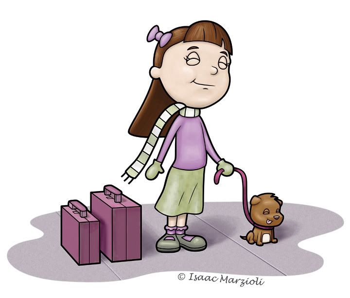
Now, I'm not talking about the drawing...but that I recently changed my blog title from "The Boring Penguin Blog" (well, briefly it was Zombie baby pictures, but everyone that went to my blog thought it was going to be zombie pictures...and I was meaning zombie baby pictures figuratively...) so I changed it to Heebeejeebees. I changed it because I wasn't drawing penguins, but either cute little square animal toy creature things and the blobs that ate them. But suddenly all I'm drawing these days are cute things...and forgetting to include a horrible twist. the picture above is an example of that...
Anyhow - I struggled mightily with the color. I went into photoshop with a very clear color palette:

It's a habit I've been trying to get into - picking my colors in Illustrator before I export to photoshop. Basically I take a couple of colors I want to use - and then plug them into the color guide. It then gives you a spectrum of colors that compliment or are shades of or contrast the color you chose. I make my swatches (a bunch of squares) and then apply a color to each square.
Anyhow - things were rolling along quite well - with the green and purple...but then it came time to color the dog...I think that went well, but then the suitcases...I almost just took them out completely (but then I would have lost the story in the illustration)...I think I got the color to work, but I'm not in love with it...any suggestions?
I'd also like to hear - if you have time, what you think of the composition and characters and such...but only if you have time! Also - I really want to take my drawings to that next level. So feel free to be harsh! No need to pull punches! I needs to get the suck outta my drawings! And thanks in advance! Unless you didn't have time to comment...then nevermind...
EDIT: Now I made some changes - The first thing I did was do 'self colored lines' which looked horrible. It's something I haven't done before (I like the thick black line) so even with all the time it took to break up the lines from each other, I still had to scrap the idea...i dont even know if the changes show up on this small version...but basically I added a slight pinking to her cheeks - I had to tone it down from where I originally had it as the more pink i added made her look like she was bruising, not blushy...I also added some yellows to her greens. And to top it off I added a 16 percent saturation. Before I saturated it, I didn't even realize how grey her face was. Maybe I was zombie-ing her up a bit. There IS hope for me!
PS - I'm thinking of going to the San Diego SCBWI convention Feb. 7th. Has anyone been to this one before? I just joined the scbwi on the 1st, and I have no idea...but I'm going to go and I'm going to show. Or sit and listen...or what is it that they do, and what is required of me? If anyone is even still reading - maybe you could drop me a line at isaac@isaacmarzioli.com and let me know what to expect as an illustrator. There's a 20 minute crit with Joy Chu...and you can set up a 16 inch display...but it has to be a verticle display...and no postcards or things on the table...everything has to stick or protrude out of your verticle display. Say huh?


8 comments:
Frankly, I think you are being too hard on yourself. Typical artistic angst. ;)
I like the way you have devised a color palette for yourself. It's very ingenious. I have a limited palette of watercolors that I use in my paintings. Amazingly, you can get a huge number of colors by mixing two other colors together. I think you may try doing something similar in Photoshop. Add some compliments to the tones you have going on and see if that doesn't pop the art a bit more. (ie yellows in the purples, pinks in the greens, etc...)
Hi, Isaac! I agree with Lyon completely: you just need some pop in your color scheme. Right now it's just a little too drab with the gray tones (grayish purple, grayish green etc). Try to see if some complementary colors can liven things up. Mayhap a pop of rose on her cheeks as well because, for some reason, the girl's complexion looks a little gray on my monitor - but that could just be me O_o
I would LOVE to see a little blush of pink on her cheeks and maybe even her nose. Otherwise I think you might be too harsh on yourself. Little highlights and low lights can really spice a piece up.
I would LOVE to see a little blush of pink on her cheeks and maybe even her nose. Otherwise I think you might be too harsh on yourself. Little highlights and low lights can really spice a piece up.
I meant it's horrible because I'm turning into Mary Engleblech!
As far as the rest of it - the feel free to tell me I suck - that's just the way I talk...
By the way - thanks for the advice, I'm going to have to go back in and see about applying some of those changes...especially (hopefully) getting the gray outta her face...or maybe I could say she's a zombie...
Isaac this totally isn't as bad as you think it is. :) Like the others have said, all it needs is a couple of color spots to make it pop -- like blush on her cheeks and maybe a bit of yellow in the highlights of the green skirt, shoes, etc. I see you've got some nice yellows picked out in the color swatches, some of those would do quite nicely.
Composition is good, and I can feel the excitement of waiting at the airport!
I like the color pallette. I tend to go for drab colors myself, but I also like to add some opposing colors to add pop to the color beneath. So I try to use a warm color to shade a cool color or a cool color to shade a warm color.
I would also like to see the warmth in her cheeks. If you are going to make it cute...make it reaaallllyyy cute! LOL
I like the matching expressions on their faces and the depth of the ground. The suitcases add some dimension, so overall I find it to be very cute and pleasing.
I know what you mean about how things just come out cute. I tried drawing some gothic, depressed girls and they just came out cute...LOL Go with your strength and make it all cute. :)
Christy
Tell me about it, my stuff used to be way dark. Blood, goth, depressed...but then I found the Light and I can't draw a darn evil thing. :P
Isaac, I adore your style, and I think what's missing is the pop of color. Everything has the same "tone" to it. And with such stark black lines, I feel you need bright colors. Your pink pillow characters are a great example of this. They work beautifully, because they're so bright!
I think the palette you have is awesome! But I feel like some are being lost or used just a smiggin'. Risk it and go for it! On your site, in other pieces of work (not the "cutsy" stuff), things come together. Maybe look at those and compare.
I understand how frustrating it can get, believe me. We're all crazy and see things so differently than others. And if you object to that, then you're even more crazy! :P
Post a Comment