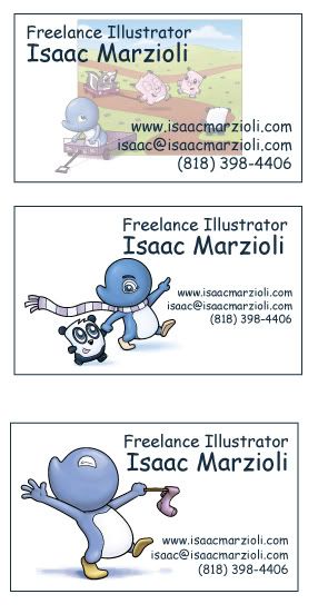
here are a couple of prototypes - I wonder what you'll think...maybe you can comment? I'm probably going to have them printed up this week (the conference is on Feb. 7th).

would you even include one image? I mean, if it's a great one then terrific - but way back in school I think I remember someone saying something about how if you put that you're this or that or include a picture that they'll maybe only think you can do that one thing...? I'm obviously keeping my cards very simple...I was thinking of putting an image in full color on the back and then my info on the front...and it's not that much more expensive...


7 comments:
Hi Isaac,
Congrats on the conference! It takes guts to put yourself out there. I hope it goes well. :)
I really like the bottom two. Both of them work really well representing your style and characters. If you are going to put a full color on the front, then I like the top without any text or the octopus swallowing the skunk--love that one.
I like the order of your text with your name bigger and free-lance smaller.
I would definitely include images. They will need a visual to remember who you are and Adelia will do that. :)
Best wishes and I hope it goes well.
Christy
I agree with Christy. I think that my favorite is the center one- simple, but very "You". People are drawn to images and it is what you do so you HAVE to have some kind of image.
I also like the bottom image I think from a graphic design stand point, it fills the card the best. you might also think of putting the top image on one side of the card and then all of your information on the other side. Good luck at the conference.
I agree that the bottom one is the best from what Wendy said...a graphic design point of view. I like the movement that is going on and it best fills the space. Just like with postcards, you want the text to interact with the image. I think the image works with your portfolio, and if you place an image on the back then let it be something different if you're worried about being "boxed in". If you do an image on the back also be sure it full bleeds. I think that would make a bolder statement and visually work with the rest of the card. You have the solo on the text side, so you wouldn't want a lot of white space on the back. :)
Good luck! Haven't been to a conference (live in the midwest) so it's difficult to find the money to travel to them. :/ Someday tho, that's my wish. So SO glad to hear you're going one, even if it's for one day. You never know! :D
Remember to have fun.
I agree that the third is best.
I also like the third one best compositionwise, it is the most balanced and it is visually appealing. A business card is like a mini composition in itself! A full bleed additional illustration on the back is a nice idea, too if you're worried about showing more variety.
Definitely have an image on your business card, since images are what your business is all about!
Have fun at the conference :)
thanks for the comments! I just ordered my cards! And because you suggested it, I added a full bleed picture to the back! I think it looks terrific! I'll post what they look like later tonight...
Post a Comment