
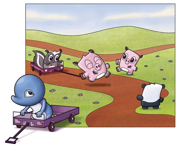

Well...this piece took FOREVER! I've been used to doing a lot less scenery and characters in my drawings - so putting 5 characters into one - and one where they're not in snow - meant that this one just took forever to finish. But is it done? I'm putting it up here, before my blog - because I want to know what you think of the color and everything all together. Even if you see something wrong with a character or line or perspective or whatever. I still have my vector image preserved, so I can still easily change my lines...but what do you think?
I'm going to attend the San Diego one day conference (the ny one is too far) on the 7th of February...and I want this to be my lead image in the port review and if I get the chance to show anyone. So, obviously, it'd be important to make this image the best it can be.
EDIT: I've put it up on my blog - with Pete's suggestions! Thanks for your help Pete! Also - if anyone else wants to say anything - I'd love to hear any other suggestions! I would have put the new version up on this site, but for some reason it won't upload...


14 comments:
Nice job, Isaac. I was confident that your colors would round out those characters, and they sure did! I like the land...it compliments your characters.
I like the framing you created, but I noticed the square isn't complete/colored near Adelia's left armpit...not sure if you care about that...
Also, does that rear trail make a tangent with the right ear of the piggie (on the right)? I only mention it cause you love them, right? :)
These characters look great!
thanks pete! I had assumed the bit under Adelia's armpit was outside the frame...but it should be in. I'll add grass to it immediately! As for the tangent - I don't think so...it may be more of a vortex (just like where the road leads into the panda's hair)...or maybe I'll just move the ear up so it won't be something...
Looking good, Isaac! Moving Adelia in totally changed the dynamic of this, now I REALLY feel sorry for her (heh). I didn't even catch the white space under her arm, Pete has sharp eyes!
I wonder what the hills in the back would look like if the line wasn't so heavy? Or a different color, such as a darker shade of green? It just seems a little dark to me, but it's a pretty minor point I think.
You did a great job with the colors!
i yield to your experience...its not really anything that bothers me...just looking for the slightest details cause the piece looks very polished.
i'm relatively new to seeing "tangents" so i may be having trouble identifying them correctly-thus misusing the term.
is your portfolio review by appointment? i've only been to one and it was very fast.
My actual piece is 11x13 or so - so the ear doesn't look as tangenty as it does (and I'll concede that it does - I only like pointing out others tangents, not my own) in the smaller web version.
And the port review is by appointment - Joy Chu (used to design and work for a couple of publishers and now she's a freelance designer...or owns her own design firm or something) is going to spend 20 minutes with each illustrator. I'm hoping to get some good feedback from her, but I'm also hoping that there will be other chances to show my book at this convention in San Diego - it's my very first one ever, as I signed up with the SCBWI just 2 short weeks ago!
I think it looks done! The only thing I can say is that it might add depth to add some smaller flowers in the back area...but I dont really know if that is necessary. Nice job, great portfolio piece.
Based on what you plan to change, I don't notice anything else at all. :)
Best of luck at the conference and I hope she loves your portfolio. When I took mine, it got chewed up and spit out. LOL That is why I joined this group and started making changes. I intend to learn from my mistakes (tangents)! LOL
You do a great job with color and character development. :) I hope you find some people that love them.
I had thought about smaller flowers in the background...my wife also had a couple of suggestions...so I guess this piece is just a couple more steps away from completion.
I'm going to add those flowers, I've already smallened the line for the hills in the background...and I"m going to add a little saturation to the sky and desaturation to the ground (those two are my wife's suggestions).
Thanks for your help! This piece will kick so much more ass because you kids came in and bashed my head with revisions. Okay, it wasn't a bashing, but thanks for the suggestions still!
Hi Isaac. Looking good- great to see it with color. The only thing that I notice is the green in the grass- I feel like it needs a little shadow. There is a lot of green and it is feeling a little flat to me. Other than that (and the tangent ear of course) I like it a lot. The Adelia placement looks much better here. Good work- you're almost there!
With the color changes the green doesn't bother me anymore.
Yea, that new sky really wrapped it up nicely since it balanced with Adelia's color. Great work, Isaac ^_^
its totally done! If you work it any further it will be over worked. Its perfect!
Man, I have been way too busy. I have been reading the posts through email, but haven't had the chance to say anything...and now it's over. Phewy. :(
Besides that tho, AWESOME work Isaac! I love the rework you did to it, totally brought everything together. I was going to say bring more flowers in...and you did! The new clouds really add to bringing it together too. The thick, white, and puffy clouds compliment your style.
Cheers mate, a great portfolio piece! :D
Spot-on, Isaac! Those changes are just what it needed, the sky saturation and clouds really balance it out so well. Good luck at the conference!!
Post a Comment