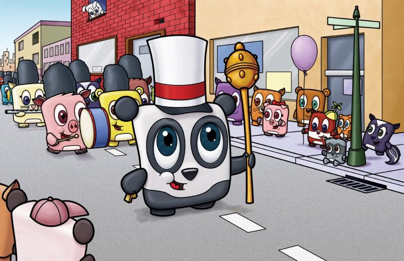
You'll, of course, have to click on the picture to see the entire thing - But since it was such a detailed picture (for me) I wanted it to be as big as possible.
This is supposed to be the center piece for the little gallery show I'm doing in July for Nickelodeon...and I HAVE to make it perfect! All sorts of artists and snobby types will be walking by this crap and judging...and I want them to smile when they see it, not frown.
So anything you might be able to see or help out on would be appreciated!


10 comments:
Most excellent, Isaac! I saw this one as a sketch on your blog, so I was excited to see how it'd end up. I think this one's great. I like the vast number of characters and how their colors interplay against one another. You're treatment of the lighting is very consistent and effective. I also like how all lines point to the panda...from the eyes of the gawkers to the rows behind. It feels very focused.
Sheesh, it's tough to see places you haven't considered already. Hmmm...maybe adding some straps to those hats (danglers?). I know those are marching hats, cause I was in marching band throughout school, but it might help clarify for those "not in the know." Also, maybe more highlighting on the baton. That's all for me. VERY minor crits.
It's really well done and looks complete. The details are fun, from the spot on the dog by the street sign to the shadow of the flute on the road. Is this Photoshopped?
Yes sir...all photoshop, all the time! Well - I did the lines in Illustrator and then transported them into photoshop as smart objects (which means that I can still edit the original lines in Illustrator at any time AND they maintain their vector quality)...
As for the martching hats - I was hoping they'd read as that and not russian hats (which is what I think they look like now)...but maybe this is a russian parade...I'm sure they have them too...
I like this. The only thing You might consider is contrasting the back of the panda (that you are seeing the back of in the forefront) from the top of him a little bit more. The shape is really strong and at first doesn't quite read.It may just be how it uploaded.
Patti
This is fantastic, Isaac! (Ha, I had accidentally originally written pandastic). So much going on here! The lighting looks good, looks like high noon. Perspective looks spot-on, colors harmonious! Everyone has great expressions and the panda is clearly the focal point.
One thing I notice, the cat playing the flute -- the hand that is showing will actually be over the flute rather than under, with his other hand being under. Also both hands will be way to the side of his mouth. Right now it looks like he is blowing right in the middle of the flute instead of the mouth hole. Put "playing the flute" in Google images and you'll see what I mean. (Sorry, flute-playing family here, heheh!)
The other thing is rather minor; I feel like the street should be a little darker, right now it is so close to the sidewalk in value.
Looks great otherwise! I can feel the parade excitement from all the bystanders!
I love this. Very detailed and very presice. Great colors and the details are perfect. I didn't notice the flute, but I think Carmen is right. :) It is great and the people viewing it should be impressed. :)
This is really great. It looks like it would be an awesome video game to play if they could keep the characters this alive and cute. Very nice, I think you will get many smiles at your show. Why is there one missing brick in the wall? Just curious.
heh...the missing brick was for absolutely no reason in particular...I thought it would be interesting or that it would add interest to the wall...as long as it's not too distracting...I should probably add an eyeball in there...
LOL love the eyeball idea Isaac! I very much enjoy looking at this piece, and every time I view it I find something new! Never noticed the brick, at least not yet. :P Now I do. How fun!
I agree about the panda in the foreground and the road. Other than that, I think it looks fantastic!!! :D The eyes are stronger too, I think you're achieving what you're aiming for.
Isaac- This is my favorite illustration by you so far. I love all the colors, the facial expressions, and the action. There are only a couple of things that I can note, but they are all minor. I think that the balloon should have a little more reflection and the street sign should have something written on it. And for some reason the bill of the panda's hat is annoying me because it is the same color as the panda's black fur. Is there any other color you can make it so that it isn't the same? Regardless it looks great. Love the little pig with the bow!
I like the missing brick, it just caught my attention. I like little details like that, they make you ask why?
Post a Comment