
Really quick question for you guys: what scanner do you use to scan your images? I have such a hard time with my scanner, since it puts a pink line in the middle of my drawings and I usually have to scan it multiple times so I can piece it together in photoshop.
Also, I plan on working in pastels and quite possibly on big paper. Will taking pictures of these works suffice, or should I look for oversized scanners?
Advanced thanks for your help :)
Tuesday, January 6, 2009

Monday, January 5, 2009
Late Nights
Hey, just a fyi, for 2009 I've created a new schedule so that I, hopefully, will spend more of my day working instead of dilly daddling. But, this new schedule requires I don't chit chat online until after 8 or 9pmish. So throughout the day it isn't because I'm ignoring you guys or don't have anything to say...it's just gonna be late night before I get to it. Setting some special time aside just for you! Whooo! :P
Just wanted to let ya know incase you start wonderin'. hehe anyhow, ciao. :)
Just wanted to let ya know incase you start wonderin'. hehe anyhow, ciao. :)
If - wip/ink

So here's the color I have so far. I would love some feedback about what is working and what isn't, just keep in mind this isn't finished. :P

Okay, so here is the inked image, and you can see all the things I kept and all the changes I mentioned in my post(reply) for the sketch. Also, to answer the question as to how I drew the sketch...I used a blue prismacolor pencil on canson tracing paper. :) To erase I used a Tuff Stuff pencil eraser (or in lamest terms...the while eraser). A kneaded eraser didn't work so well. o.O
Panda having Tea

I wanted to share my second illustration of the Panda having tea. I loved a lot of the suggestions everyone offered. Thank you all for your help. I'm really loving this critique!
Sunday, January 4, 2009
IF - wip

I've been debating what to do for Illustration Friday this week and thought of this last night. I'm currently about to embark on illustrating a book about bedtime and thought I'd practice a bit. So the resolution here is helping a toddler fall asleep in his own bed. While I was drawing it I was imaging the poor thing had a nightmare or was tossing and turning. So mom, being the nurture (can't wait to be a mom someday!), comes to settle him.
I would love some feedback on my perspective as well as the composition. Perspective, ugh, is NOT a strong suit of mine and last night my boyfriend (Brian) n' I sat and figured out the basics of two point. I should have paid more attention in class. :P Go figure.
The piece will be painted in watercolor on hot press, using lots of purples, yellows/oranges, and blues. At least thats what I'm envisioning.
It's horrible - now with more edits!
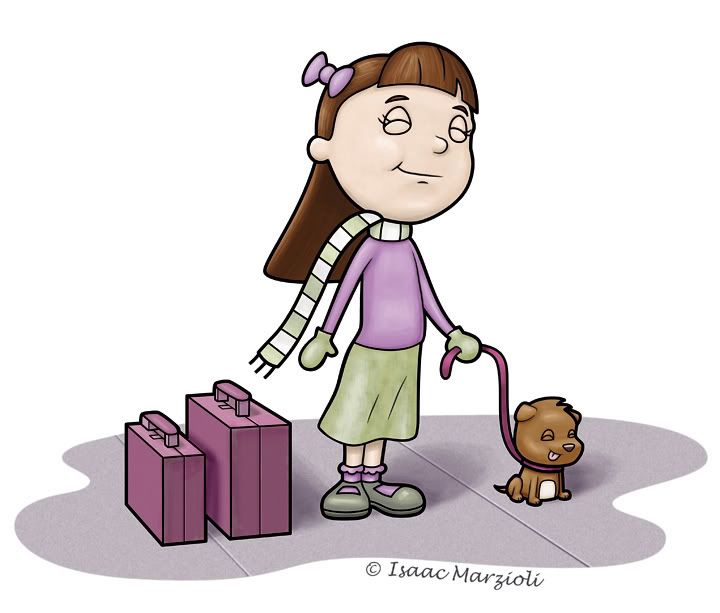
Now, I'm not talking about the drawing...but that I recently changed my blog title from "The Boring Penguin Blog" (well, briefly it was Zombie baby pictures, but everyone that went to my blog thought it was going to be zombie pictures...and I was meaning zombie baby pictures figuratively...) so I changed it to Heebeejeebees. I changed it because I wasn't drawing penguins, but either cute little square animal toy creature things and the blobs that ate them. But suddenly all I'm drawing these days are cute things...and forgetting to include a horrible twist. the picture above is an example of that...
Anyhow - I struggled mightily with the color. I went into photoshop with a very clear color palette:

It's a habit I've been trying to get into - picking my colors in Illustrator before I export to photoshop. Basically I take a couple of colors I want to use - and then plug them into the color guide. It then gives you a spectrum of colors that compliment or are shades of or contrast the color you chose. I make my swatches (a bunch of squares) and then apply a color to each square.
Anyhow - things were rolling along quite well - with the green and purple...but then it came time to color the dog...I think that went well, but then the suitcases...I almost just took them out completely (but then I would have lost the story in the illustration)...I think I got the color to work, but I'm not in love with it...any suggestions?
I'd also like to hear - if you have time, what you think of the composition and characters and such...but only if you have time! Also - I really want to take my drawings to that next level. So feel free to be harsh! No need to pull punches! I needs to get the suck outta my drawings! And thanks in advance! Unless you didn't have time to comment...then nevermind...
EDIT: Now I made some changes - The first thing I did was do 'self colored lines' which looked horrible. It's something I haven't done before (I like the thick black line) so even with all the time it took to break up the lines from each other, I still had to scrap the idea...i dont even know if the changes show up on this small version...but basically I added a slight pinking to her cheeks - I had to tone it down from where I originally had it as the more pink i added made her look like she was bruising, not blushy...I also added some yellows to her greens. And to top it off I added a 16 percent saturation. Before I saturated it, I didn't even realize how grey her face was. Maybe I was zombie-ing her up a bit. There IS hope for me!
PS - I'm thinking of going to the San Diego SCBWI convention Feb. 7th. Has anyone been to this one before? I just joined the scbwi on the 1st, and I have no idea...but I'm going to go and I'm going to show. Or sit and listen...or what is it that they do, and what is required of me? If anyone is even still reading - maybe you could drop me a line at isaac@isaacmarzioli.com and let me know what to expect as an illustrator. There's a 20 minute crit with Joy Chu...and you can set up a 16 inch display...but it has to be a verticle display...and no postcards or things on the table...everything has to stick or protrude out of your verticle display. Say huh?

Saturday, January 3, 2009
Christy Croll/Tiddly Inks First Blog Post
Hi everyone. I am in the middle of getting my portfolio site completed, but hopefully it will be done soon. :) I am so thrilled to be part of this group. I have been blown away by the talent I have seen so far--really amazing stuff! :)
This is one of the watercolor and ink paintings that I planned to post to my pending site, so I would love some feedback in case I should reconsider or redo.
This is ink, watercolor, and colored pencil on 140-lb Canon cold-press paper.

This is one of the watercolor and ink paintings that I planned to post to my pending site, so I would love some feedback in case I should reconsider or redo.
This is ink, watercolor, and colored pencil on 140-lb Canon cold-press paper.

Subscribe to:
Posts (Atom)


