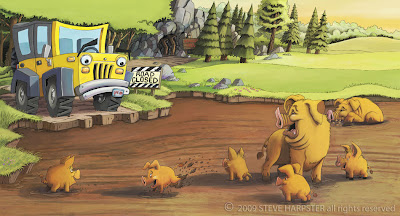
This is a book proposal I am sending out to publishers in a week or two. I sent it to one publisher that I frequently work with and they liked it but thought it was a little too close to the little train that could, which is exactly what I modeled this book after so I wasn't surprised by that. The editor encouraged me to send out the book to other publishers though.
I just wanted to do two full color spread page to show that I can draw and color. Wanted to make sure this is reading good. Too set the scene it's late in the day so that's why the sky is so yellow as the sun is starting to set.


5 comments:
Steve, this is so humorous as always! You have a way of making all of your characters so funny and full of personality. Boy, I don't think I could have pulled a personality out of a jeep!
This looks great compositionally for a spread. Good and balanced and doesn't look cut in half either.
I was thinking that the pigs could be slightly pinker... I realize they're probably caked with mud, but maybe some areas that get a bit pinker than they are. A very warm pink since there is a setting sun. Also, maybe some more highlights on the ripples of mud. It definitely reads as mud as it is, but it could look wetter!
Great job with the long shadows and atmosphere. I love all the details of the scenery, like the itty bitty owl in the distance next to the mine shaft! This is a great illo and I'm sure it would be a good one to send out to publishers.
Terrific Illustration! I love how developed the entire scene is...! Great characters (even the jeep has personality! Great job).
One thing I was thinking is that since the jeep is yellow - if it's later in the day, what about making it an orange sky? Or a little more orange...the only reason I say is because the yellow/green grass kind of bleeds in with the sky...and there's just a lot of yellow.
The only other thing I could think of is the heads of the big pigs...they overlap the grass behind them, but on places (like the left ear of the standing pig) it almost tangents or goes straight across as if it continues that line. is it possible to move the one pig's ear up (which will take care of that) and move the far pig further up (so he doesn't tangent with the curve of the hill).
Those are small things though...I like the textures you put into the muddy water and to the grass...everything reads as it's supposed to. Great job, once again!
This is very well developed, Steve. It really shows that you planned out all the details.
I agree with the comments about the sky, but its hard to know how much impact it would have without seeing the text placement. A redder sunset might help to compliment all that green foliage to set things apart.
The piggies are my favorite. I love that little guy who's kickin' the mud up in the air. The pig to the right of the largest one has different color mud on his feet than the rest of 'em....that just popped out at me.
It might also be cool to see some reflection of the jeep on the wet surface of the mud.
Finally, and this one is just my opinion, the eyebrows on the jeep. The left brow read as a wiper blade to me and I missed the right one, initially. I wonder if you could change the shape of the top of the windshield, or hood, to mimic the browline instead of using them...or use wiper blades to show the expression. I do like that you used the headlights for eyes. I always wished Pixar had done it that way in "Cars."
I like the personality of the pigs and jeep. I agree that a little more pink in the pigs would be good colorwise. I think it works well as a complimentary color to the green and there are a lot of yellow tones.
Hey, Steve! Bringin' up the rear over here - sorry I'm late lol.
I agree with Isaac about the pig's ear right at the grass line. I will also put in my vote for a bit more pinks, maybe throw in some orange in the sky to balance the weight at brown-pinks of the mud, or some light purply shadows. I think that would give some highlight-lowlight that would round out the three-dimensionality of the hills and tree canopy.
I did notice that there's some spatial issues going on by that tree canopy on the left of the page, where it rests above the jeep's top. It almost looks like the jeep is supporting the leaves because of the way the canopy conforms to the its shape (specially on the jeep's - or viewer's - right side.)
I think Pete mentioned the windshield wiper eyebrows. The right (viewer right) eyebrow is a little indistinguishable from the darkness behind it. It doesn't pop as much as the other eyebrow.
But this is a really nice beginning. You're illustrations are always brimming with personality ^_^
Kris
Post a Comment