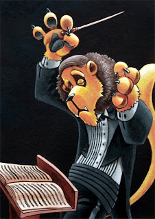
If you haven't figured it out already, I'm a pretty slow worker. Here's my latest. Its acrylic on paper. I'm trying to find that balance on my website for animals and children. I had originally thought of adding the highlights of a spotlight shining down from above, but I'm not confident on how to pull that off with paint. I had also considered adding a muted audience in the background but I really wanted to isolate this character...kinda like a spot illustration, I suppose.
(I reposted the image...it was fuzzy)


9 comments:
i think it's a good illustration of the character - and the music book/podium are well done and quite dimensional.
I think that if you did add an audience then it would open up the piece a little. Right now it's very close and some indication of background would open it up.
Of course it works as a spot illustration.
One thing is that the left hand comes out and because of the angle it could also look like he's holding the side of his face. I think it needs a little seperation so as to avoid that. seperation or possibly a different angle.
And for the spotlight - why not experiment in photoshop and see if anything you do there would be something you'd want to add to the piece...?
Thanks, Isaac. Do you have any suggestions on how to create the separation other than a redraw/repaint? My first instincts are to add more highlights to the top of his forearm and fingers...maybe brighten things a tad? I need to be better about posting the pencils before I go to paint. I like the idea of repositioning the arm.
I need to find a "Photoshop for Dummies" book.
Thanks for the suggestions!
grrrr....I posted and my login didn't go through. Dang. :( Well...lets see if I can't sum up everything I said:
Like the dramatic emotion with him being solo, yet I see what Isaac is saying about adding an audience. Maybe photoshop them first before you go to paint to see what it would look like.
The lighting is soft, gives the viewer a sense of the music that is playing. If you added more light, I would suggest keeping it soft. It feels spotlight like to me already.
As for his hand (paw) holding is face, if you dimmed the highlights in his mane , bottom going up, it may help. But I honestly didn't notice it until I read Isaac's post...now I can't stop looking at it. :P
Beautiful work Pete, taking a long time on a piece is a great thing. It pays off. Now if I could just convince my students that, teaching would go a lot smoother. :/
I think it is lovely. I love the emotion of the lion.
With the back ground instead of an audience maybe just a variation in the back ground color. I would try it in photo shop before you but paint to paper.
put not but
Great character, Pete! I like his dramatic pose, the expression on his face makes him look like he's lost in the music. I didn't notice the left paw either at first but I think if you made that side of his mane more in shadow, it would help the paw to pop out. I like the position of the paw though. Maybe a little fuzzed-out of focus on the mane around the hand?
I like the subtle audience idea -- very dark gray if you did that, so that they still melt into the background. Or if you did want to do a spotlight, you could even use gray colored pencil to lightly get that in.
A good piece for the portfolio I say!
I love the gesture, the inwardness of the character's expression, the negative space, the podium. I even think the lighting is really nice. Could be pushed a wee bit maybe, but a good effect to start. I really like this one! I hope you do more with this character.
Thanks, all! I will post my next sketch before going to paint to get your opinions. I've got PhotoShop, but I'm very novice...I know there are some good tutorials online...I'll check into that and see what happens.
I like it as is, Pete, but I could see that you could do more with Photoshopping some additional little things in and seeing what happens. :)
Post a Comment