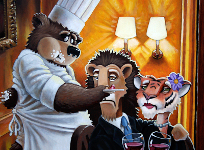
the wizard of oz reference in this painting was completely inadvertent but really funny when i made the connection! and, yes, i live in kansas, so maybe its something ingrained...
anyway, here's part 3. i'm currently trying to figure out how to get these three on the mailer. i'm very guilty of not having the card design in mind first, but oh well.
hope everyone had a great thanksgiving!


4 comments:
oh my! heh.
I like the characters! The snooty patrons, and it's nice that you have the bear in three different illustrations and each one shows how you can draw him, not only consistently, but with such character! Good stuff.
There are a couple of things in this illustration that I noticed. The first is a small thing and that's the lights behind the couple are almost a lion face. Is that intentional? I don't know why I'm posing it like it's a problem...because I'm just curious.
More importantly - The couple is flattened out in this illustration - and I think it's because of how far the arm extends into the male lion...or possibly even just how they're placed with the bear. I can't think of a solid solution, but it's something that's bothering me about this illustration. Especially since all three characters are done so well, it'd be a shame to have them flattened out.
Hey, that does kinda look like a lion. Hmmm...not intentional.
I see what you mean about the couple flattening out. I'm also stumped on a solution - aside from redrawing the whole thing and placing the bear behind the lion and presenting the dish over his shoulder. But, the cards are already ordered, so it'll have to do for this round.
Thanks for mentioning it, Isaac.
aw...not even going to post the cards for us to grapple over?
I think the bear is great. It really shows that you can carry a character from page to page. I agree that the 2 cats look a bit flat. I wonder about that hard white edge around them. I think the positioning of the characters feels al little off. You might be able to make adjustments in photoshop.
Post a Comment